How I built yuriishumak.com
A personal website that started as a simple portfolio idea and ended up becoming a small publishing system for ideas, proof, experiments, and commercial conversations.
Build log4 mins 19 sec
website buildingpublishing systemsAI-assisted developmentcontent architectureproduct thinkingpersonal website
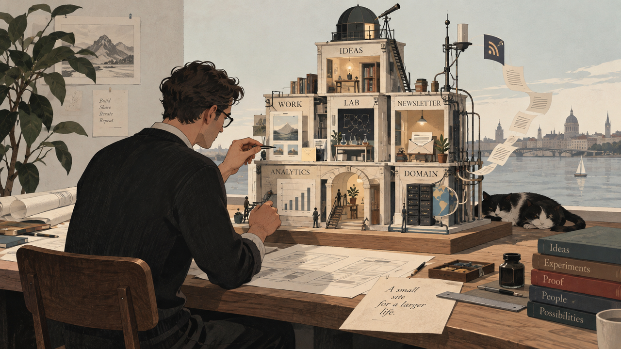
I had wanted a personal website for a long time, but every version I imagined had the same problem.
It either looked like a résumé with better typography or like a small consulting website trying to sell something on every page.
Neither was what I wanted.
I needed a place for several things that normally live separately: ideas, work, experiments, proof, and eventually commercial conversations. More importantly, I wanted the site to show how I think, not just what I have done.
That changed the project.
The first decision was what the site was for
Before touching the design, I tried to answer one question:
What should someone understand after spending ten or fifteen minutes here?
Not my job title. Not a list of services. Not a collection of logos.
I wanted the answer to be closer to this:
I work on complex B2B products where the marketing problem often cannot be solved by choosing another channel.
Sometimes the constraint is positioning. Sometimes it is product understanding, category maturity, buyer behavior, internal execution, or measurement. Sometimes the marketing ceiling is simply the business ceiling.
That became the center of the site.
Once that was clear, the structure started to make sense.
Ideas became the place for thinking.
Work became the place for evidence.
Lab became the place for experiments and interactive models.
About explained the path that led me here.
Work with me handled the commercial side without taking over the rest of the site.
That sounds obvious now. It took several iterations to get there.
The homepage was the hardest part
The early homepage tried to explain too much.
I kept adding context because I did not want the site to feel vague. The result was the opposite: too many messages competing for attention.
Eventually I reduced the first screen to one job.
It had to explain what I do in a way that was broad enough to cover content, product marketing, growth, lifecycle, and strategy, but specific enough to mean something.
The line I ended up with was:
I figure out what marketing should be for complex B2B products — before choosing channels.
That sentence became a filter for the rest of the site.
If a section did not support it, I questioned whether it belonged.
I wanted the interaction to explain something
I knew I wanted the site to feel interactive, but I did not want animation for its own sake.
The useful question was: can interaction help explain the idea better than static copy?
That led to the Context Explorer on the homepage.
You can change parts of a business context and see how the marketing diagnosis changes with it.
The point is simple: the same tactic can be a good decision in one business and a bad one in another.
The interaction exists because that idea is easier to understand when you can test it yourself.
That became the broader rule for the site:
reading should be effortless; exploring should be rewarding.
Work needed proof, not claims
The Work section created another problem.
A normal portfolio encourages short case studies with a few metrics and a polished summary. That was not enough for what I wanted.
If I say that I built a content system, changed a measurement approach, improved lifecycle marketing, or grew organic demand, the interesting part is not only the result.
The interesting part is what the system looked like, what decisions were made, and what evidence supported them.
That is why the Work section is built around artifacts and evidence rather than a gallery of logos.
Then it became a real publishing system
Once the structure was stable, the project stopped feeling like a static personal site.
I wanted to be able to publish without rebuilding pages manually, so Ideas and Work moved into Sanity.
That gave me a proper content model rather than hard-coded pages.
I added PostHog for analytics, but I did not want to track only pageviews.
The useful events are things like opening a case, exploring the Context Explorer, viewing the commercial offer, subscribing, or clicking through to contact me.
Those behaviors tell me more than a traffic number.
For email, I chose Buttondown.
The newsletter is deliberately simple:
New ideas, cases, and experiments — by email when there is something worth sending.
No lead magnet. No fixed weekly schedule. No automated nurture sequence pretending that every subscriber is a sales lead.
The site also has RSS for people who prefer that.
The infrastructure came later
Only after the content and structure were stable did I finish the launch infrastructure.
The domain is managed through Cloudflare.
The site has production canonical URLs, social metadata, structured data, a sitemap, robots rules, redirects, a real 404 page, RSS, favicon support, and production analytics.
Sanity has production CORS configured.
Buttondown uses a separate sending subdomain.
Google Search Console is connected and the sitemap has been accepted.
I tested the site across browsers, mobile sizes, accessibility checks, subscription flow, redirects, and production analytics before calling the launch complete.
None of this is unusual infrastructure.
What mattered was doing it after the product decisions, not before them.
Where AI helped
A lot of the implementation happened through Lovable and AI-assisted work.
That made the build much faster.
But the difficult part was rarely writing the code.
The difficult part was deciding what should exist.
Should the homepage explain services or thinking?
Should Work be a portfolio or an evidence layer?
Should the newsletter be a funnel or simply a way to return?
Should Lab contain three impressive-looking tools or one useful model?
Should the site optimize for conversion now, or for trust and depth first?
AI can generate many plausible answers to those questions.
The work is choosing the one that fits the system you are trying to build.
That was the pattern throughout the project: build something, look at it in context, remove what felt generic, and repeat.
The site is live. The real work starts now.
The infrastructure is finished enough that I do not want to keep rebuilding it.
The next phase is much less technical.
I need to publish the first serious Ideas.
I need to add stronger evidence to the Work section.
I need to see which subjects people actually read, which cases they inspect, what makes them subscribe, and what eventually leads to a useful conversation.
The growth model is intentionally simple:
original thinking → distribution → deeper exploration → return → proof → trust → useful conversations
I do not expect the site to become valuable because of another redesign.
It should become more valuable because the body of work on it becomes better.
That was the point of building it this way in the first place.